
Data Vizualization
Infographics, info-sculptures, and interactive data visualizations. Working with numbers is a passion of PatternBased Art. Expressing data effectively can show us different angles to understand our world, and data visualization is a way to make numbers a story. We are always looking for opportunities to collaborate with talented researchers for meaningful projects. PatternBased artist Siori Kitajima has received the Information Is Beautiful Award 2022, the special 'Impressive Individual' award, with her 4 original data visualization works.
1.82% // Information and Violence
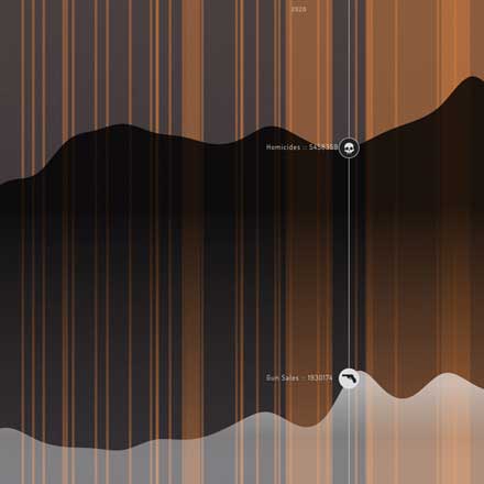
Information and Violence is an interactive data visualization showing a timeline of major U.S. news headlines along with gun sales and homicides from 2016. Since 2016, the number of gun sales and homicides has been steadily increasing. By showing them along top news at the time, it could show the possibility of the psychological influence of fear and anxiety in society.
Heartbeats.
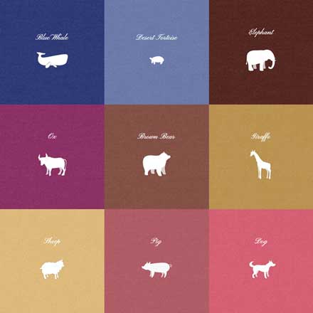
Heartbeats. is an info-art piece to make the heartbeats of animals visible and audible. More than 150 species of animals are going extinct every day. Perhaps considering the beating, breathing lives of these animals will help us do what we can to slow this extinction. It is made with simple HTML + Javascript. The animation is made with Lottie, and the music is created with VCV rack.
PULSE of LOVE and HATE
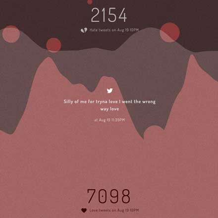
Pulse of Love and Hate is an interactive and sonified data visualization of the hourly occurrence of the words 'Love' and 'Hate' on Twitter. Many users spend time reading various online news platforms and social media without knowing how biased, curated, or personalized the content is. This project started with a simple question 'Does the world actually feel the way it appears to me online?.. or are a series of algorithms behind my notion of the mood of the world?' This simple info-art lets us see the real number of one small aspect of people's emotional mood by their tweets. Come take a peek at how and what people 'Love' and 'Hate' at this very moment.
1.82% // Violence in Ancient Societies
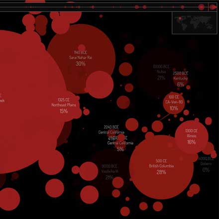
Violence in Ancient Societies is a generative data visualization showing the different levels of violence in different societies in prehistoric times (and some recent incidents). When the world was less connected, the levels of violence in each society varied widely depending on the characteristics and the culture. While no one was murdered in one society (14000 BCE in Gobero near Niger), almost half of the population was killed in another (12000 BCE Nubia near Egypt).
Perspective

This generative animation Perspective shows how many people in Singapore have experienced mental health issues in their life. 20 silhouetted characters walk past the screen randomly, and the ratio of color reflecting the mental issue the person experiences is generated from the real world data. By clicking on the colorful walkers, a user can learn about their mental health issue.
Sunlight, Fatness and Happiness
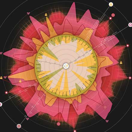
What makes a place a happy place to live – is there really a correlation between sunlight and happiness? Can you be miserable in a sunny country, happy in perpetual twilight? Does a country have to be wealthy to be happy? Are countries with heavier people happier places to live? You can use this infographic to answer all sorts of interesting questions. Or maybe it raises more questions than it answers. Can you be happy in a place where the murder rate is high? Is there a relationship between murder rates and fatness? The Sunlight, Fatness and Happiness infographic is all about your little place in the sunshine.